Data Visualisation
Most of you, if not all, will be familiar with creating graphs in Excel. Software such as Excel has a predefined set of menu options for plotting the data that is the focus of the end result: “pretty graph”. These types of menus assume data to be in a format ready for plotting, which when you get raw data is hardly the case. You are probably going to have to organise and wrangle your data to make it ready for effective visualisation.
The Grammar of Graphics
The grammar of graphics enables a structured way of creating a plot by adding the components as layers, making it look effective and attractive.
It enables you to specify building blocks of a plot and to combine them to create the graphical display that you want. There are 8 building blocks:
data
aesthetic mapping
geometric object
statistical transformations
scales
coordinate system
position adjustments
faceting
Imagine talking about baking a cake and adding a cherry on the top. 🎂🍒 This philosophy has been built into the ggplot package by Hadle Wickham for creating elegant and complex plots in R.
ggplot2
Learning how to use the ggplot2 package can be challenging, but the results are highly rewarding and just like R itself, it becomes easier the more you use it.
Unlike base graphics, ggplot works with dataframes and not individual vectors.
The best way to master it is by practising. So let us create a first ggplot. 😃
What we need to do is the following:
- Wrangle the data in a format suitable for visualisation
- “Initialise” a plot with
ggplot():
ggplot(dataframe, aes(x = explanatory variable, y = response variable))
This will draw a blank ggplot, even though the x and y are specified. ggplot doesn’t assume the plot you meant to be drawn (a scatterplot). You only specify the data set and columns ie. variables to be used. Also note that the aes( ) function is used to specify the x and y axes.
- Add layers with
geom_functions:
- Add layers with
geom_point()
We will add points using a geom layer called geom_point.
# load the packages
suppressPackageStartupMessages(library(dplyr))
suppressPackageStartupMessages(library(gapminder))
suppressPackageStartupMessages(library(ggplot2))

# wrangle the data (Can you remember what this code does?)
gapminder_pipe <- gapminder %>%
  filter(continent == "Europe" & year ==  2007) %>%
  mutate(pop_e6 = pop / 1000000)

# plot the data
ggplot(gapminder_pipe, aes(x = pop_e6, y = lifeExp)) +
  geom_point(col ="red")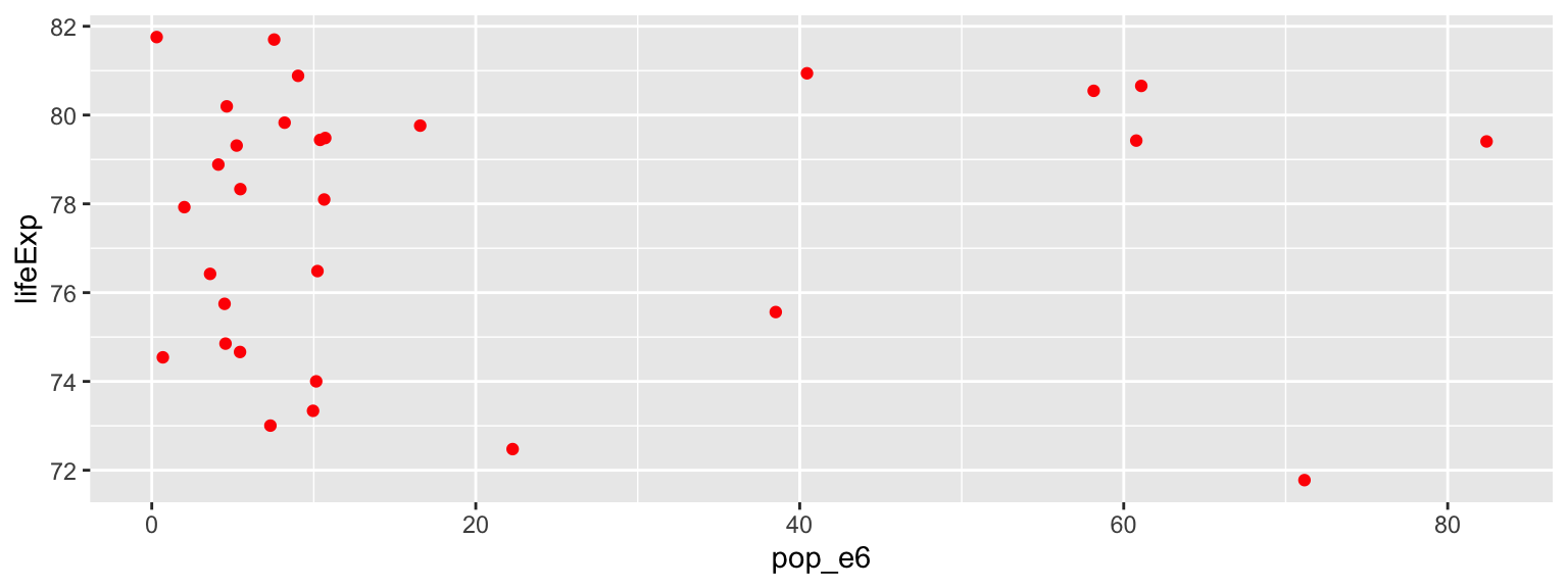
🤓💡 Tip: You can use the following code template to make graphs with ggplot2:
ggplot(data = <DATA>, (mapping = aes(<MAPPINGS>)) +
      <GEOM_FUNCTION>()
ggplot() gallery Run the following code to see what graphs it will produce.
ggplot(data = gapminder, mapping = aes(x = lifeExp), binwidth = 10) +
  geom_histogram()
#
ggplot(data = gapminder, mapping = aes(x = lifeExp)) +
  geom_density()
#
ggplot(data = gapminder, mapping = aes(x = continent, color = continent)) +
  geom_bar()
#
ggplot(data = gapminder, mapping = aes(x = continent, fill = continent)) +
  geom_bar()
🗣👥 Confer with your neighbours: Does life expectancy depend upon population size?
\[y = b_0 + b_1 x + e\]
Run this code in your console to fit the model pop vs lifeExp.
Pay attention to spelling, capitalization, and parentheses!
m1 <- lm(gapminder_pipe$lifeExp ~ gapminder_pipe$pop_e6)
summary(m1)
Can you answer the question using the output of the fitted model?
m1 <- lm(gapminder_pipe$lifeExp ~ gapminder_pipe$pop_e6)
summary(m1)
##
## Call:
## lm(formula = gapminder_pipe$lifeExp ~ gapminder_pipe$pop_e6)
##
## Residuals:
## Min 1Q Median 3Q Max
## -6.324 -2.562 1.007 2.245 4.277
##
## Coefficients:
## Estimate Std. Error t value Pr(>|t|)
## (Intercept) 77.477421 0.721723 107.351 <2e-16 ***
## gapminder_pipe$pop_e6 0.008762 0.023779 0.368 0.715
## ---
## Signif. codes: 0 '***' 0.001 '**' 0.01 '*' 0.05 '.' 0.1 ' ' 1
##
## Residual standard error: 3.025 on 28 degrees of freedom
## Multiple R-squared: 0.004826, Adjusted R-squared: -0.03072
## F-statistic: 0.1358 on 1 and 28 DF, p-value: 0.7153👉 Practice ⏰💻: Use gapminder data.
Does life expectancy depend upon the GDP per capita?
Have a glance at the data. (tip:
sample_n(df, n))Produce a scatterplot: what does it tell you?
Fit a regression model: is there a relationship? How strong is it? Is the relationship linear? What conclusion(s) can you draw?
What are the other questions you could ask and could you provide the answers to them?
😃🙌 Solution: code Q1; sample
sample_n(gapminder, 30)## # A tibble: 30 x 6
## country continent year lifeExp pop gdpPercap
## <fct> <fct> <int> <dbl> <int> <dbl>
## 1 Dominican Republic Americas 2002 70.8 8650322 4564.
## 2 Niger Africa 1982 42.6 6437188 910.
## 3 Germany Europe 1952 67.5 69145952 7144.
## 4 Bulgaria Europe 1997 70.3 8066057 5970.
## 5 Venezuela Americas 1952 55.1 5439568 7690.
## 6 Greece Europe 1972 72.3 8888628 12725.
## 7 Guatemala Americas 1977 56.0 5703430 4880.
## 8 Puerto Rico Americas 1952 64.3 2227000 3082.
## 9 China Asia 2007 73.0 1318683096 4959.
## 10 Switzerland Europe 1997 79.4 7193761 32135.
## # … with 20 more rowsWe will add layers onto this scatterplot: liveExp vs gdpPercap. We want to superimpose regression line of the best fit and non-parametric loess line that depict a possible relationship between the two variables. That means we will have:
- 1st layer: scatterplot
- 2nd layer: line of the best fit
- 3rd layer: loess curve
😃🙌 Solution: code Q2; Plot the data;
ggplot(gapminder, aes(x = gdpPercap, y = lifeExp)) +
  geom_point(alpha = 0.2, shape = 21, fill = "blue", colour="black", size = 5) + # set transparency, shape, colour and size for points
  geom_smooth(method = "lm", se = F, col = "maroon3") + # change the colour of line
  geom_smooth(method = "loess", se = F, col = "limegreen") # change the colour of line
## `geom_smooth()` using formula 'y ~ x'
## `geom_smooth()` using formula 'y ~ x'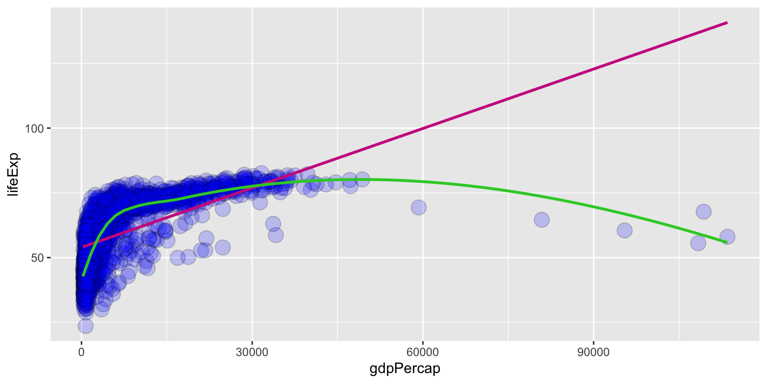
😃🙌 Solution: code Q3; simple regression model
my.model <- lm(gapminder_pipe$lifeExp ~ gapminder_pipe$gdpPercap)
summary(my.model)
##
## Call:
## lm(formula = gapminder_pipe$lifeExp ~ gapminder_pipe$gdpPercap)
##
## Residuals:
## Min 1Q Median 3Q Max
## -2.79839 -1.30472 0.00807 1.33443 2.87766
##
## Coefficients:
## Estimate Std. Error t value Pr(>|t|)
## (Intercept) 7.227e+01 6.942e-01 104.113 < 2e-16 ***
## gapminder_pipe$gdpPercap 2.146e-04 2.514e-05 8.537 2.8e-09 ***
## ---
## Signif. codes: 0 '***' 0.001 '**' 0.01 '*' 0.05 '.' 0.1 ' ' 1
##
## Residual standard error: 1.598 on 28 degrees of freedom
## Multiple R-squared: 0.7225, Adjusted R-squared: 0.7125
## F-statistic: 72.88 on 1 and 28 DF, p-value: 2.795e-09Playing with the aesthetic: adding more layers to your ggplot()
Whenever possible you should strive to make your graph visually appealing and informative as discussed in the previous section Principles of Visualisation.
To change the title and axis labels use layer labs
labs(title = “your title”, subtitle = “your subtitle”, y = “y label”, x = “x label”, caption = “graph’s caption”)
ggplot(gapminder, aes(x = gdpPercap, y = lifeExp)) +
  geom_point(alpha = 0.2, shape = 20, col = "steelblue", size = 5) +
  geom_smooth(method = "lm", se = F, col = "maroon3") +
  geom_smooth(method = "loess", se = F, col = "limegreen") +

  # give a title an label axes
  labs(title = "GDP per Capita vs. Population Size",
        x = "population", y = "Life Exp.") +

  # modify the appearance
  theme(legend.position = "none",
        panel.border = element_rect(fill = NA,
                                    colour = "black",
                                    size = .75),
        plot.title=element_text(hjust=0.5)) +

  # add the description
  geom_text(x = 80000, y = 125, label = "regression line", col = "maroon3") +
geom_text(x = 90000, y = 75, label = "smooth line", col = "limegreen") 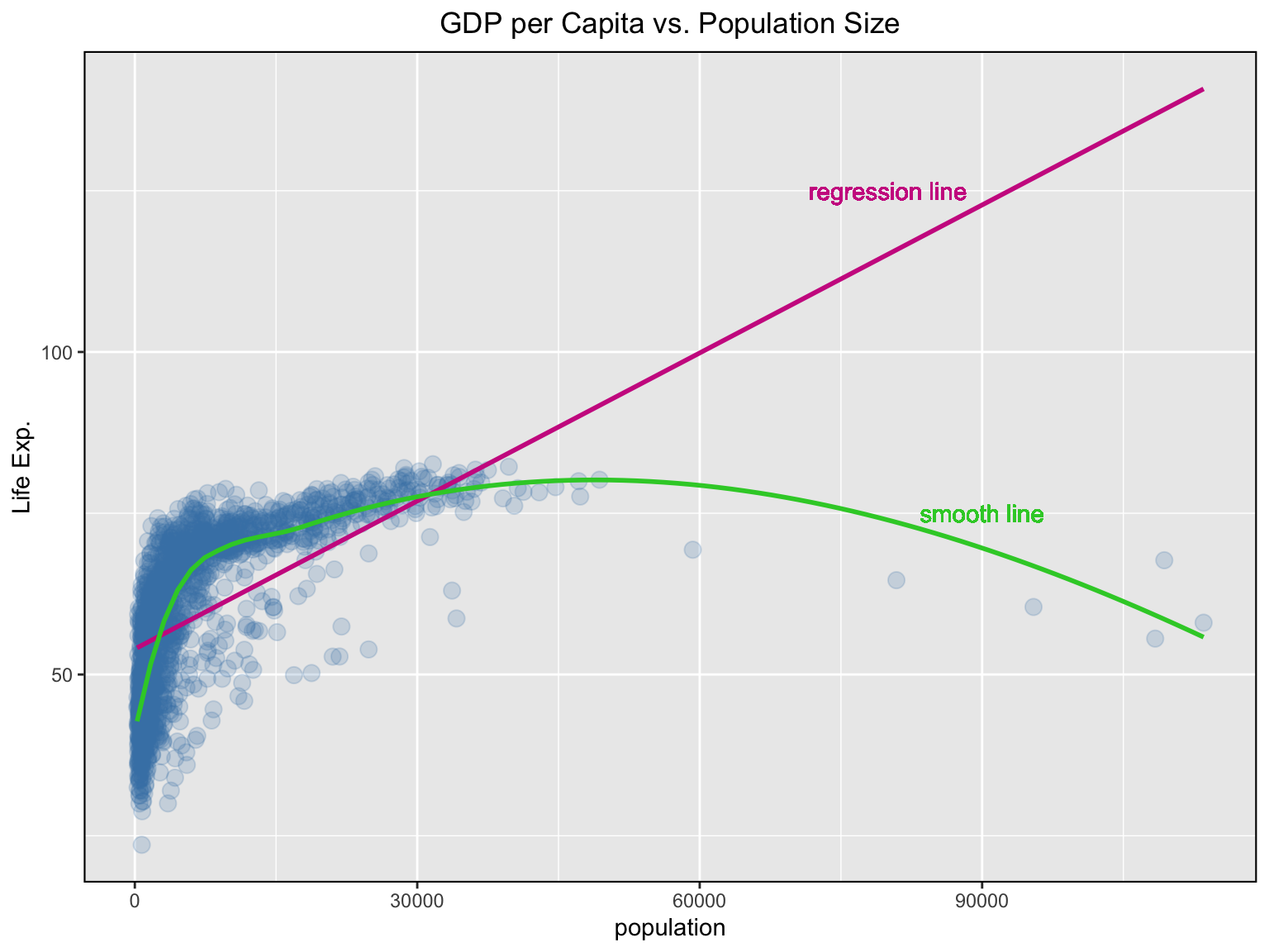
Note, that we have added text on the plot for the two lines and have edited the plot in terms of legend and its appearance.
We could also annotate the plot by using:
annotate("text", x = 80000, y = 125 label = "regression line", color = "maroon3")To learn more about how to modify the appearance of the theme go to ggplot’s theme page.
Change the colour of the points to reflect categories of another, third variable.
ggplot(gapminder, aes(x = gdpPercap, y = lifeExp)) +

  # change the colour of the points to reflect continent it belongs to; set transparency, shape, and size for points
  geom_point(aes(col = continent), alpha = 0.5, shape = 20, size = 3) +

  geom_smooth(method = "lm", se = F, col = "maroon3") +
  geom_smooth(method = "loess", se = F, col = "dodgerblue3") +
  labs (title= "GDP per Capita vs. Population Size",
        x = "population", y = "Life Exp.") +
  theme(legend.position = "right",
        panel.border = element_rect(fill = NA,
                                    colour = "black",
                                    size = .75),
        plot.title=element_text(hjust=0.5)) +
  geom_text(x = 80000, y = 125, label = "regression line", col = "maroon3") +
  geom_text(x = 90000, y = 75, label = "smooth line", col = "dodgerblue3")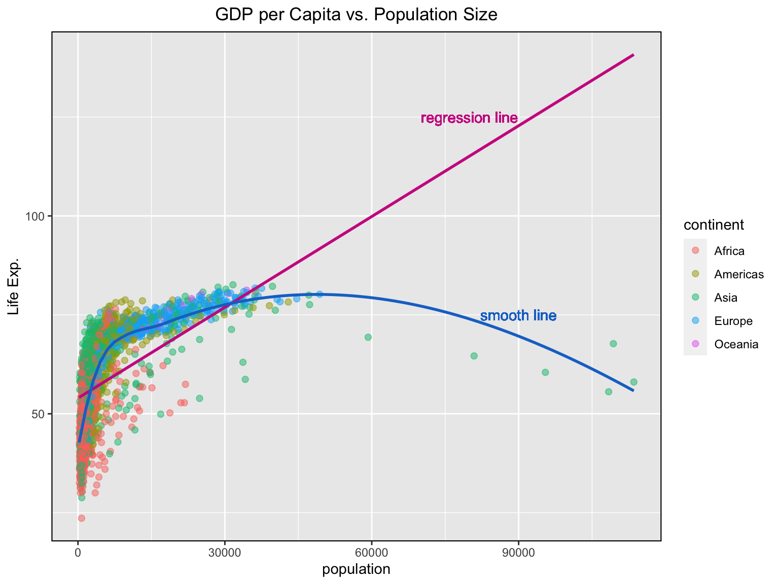
Note that the legend is added automatically. You can remove it by setting the legend.position to none from within a theme() function.
Adjust the X and Y axis limits and change the X axis texts and its ticks’ location
  ggplot(gapminder, aes(x = gdpPercap, y = lifeExp)) +
  geom_point(aes(col = continent), alpha = 0.5, shape = 20, size = 3) +
  geom_smooth(method = "lm", se = F, col = "maroon3") +
  geom_smooth(method = "loess", se = F, col = "dodgerblue3") +
  labs (title= "GDP per Capita vs. Population Size",
        x = "population", y = "Life Exp.") +
  theme(legend.position = "right",
        panel.border = element_rect(fill = NA,
                                    colour = "black",
                                    size = .75),
        plot.title=element_text(hjust=0.5)) +
  geom_text(x = 48000, y = 90, label = "regression line", col = "maroon3") +
  geom_text(x = 70000, y = 75, label = "smooth line", col = "dodgerblue3") +

  # change the limits of the x & y axis
  xlim(c(0, 90000)) +
  ylim(c(25, 100))
## Warning: Removed 5 rows containing non-finite values (stat_smooth).
## Warning: Removed 5 rows containing non-finite values (stat_smooth).## Warning: Removed 5 rows containing missing values (geom_point).## Warning: Removed 33 rows containing missing values (geom_smooth).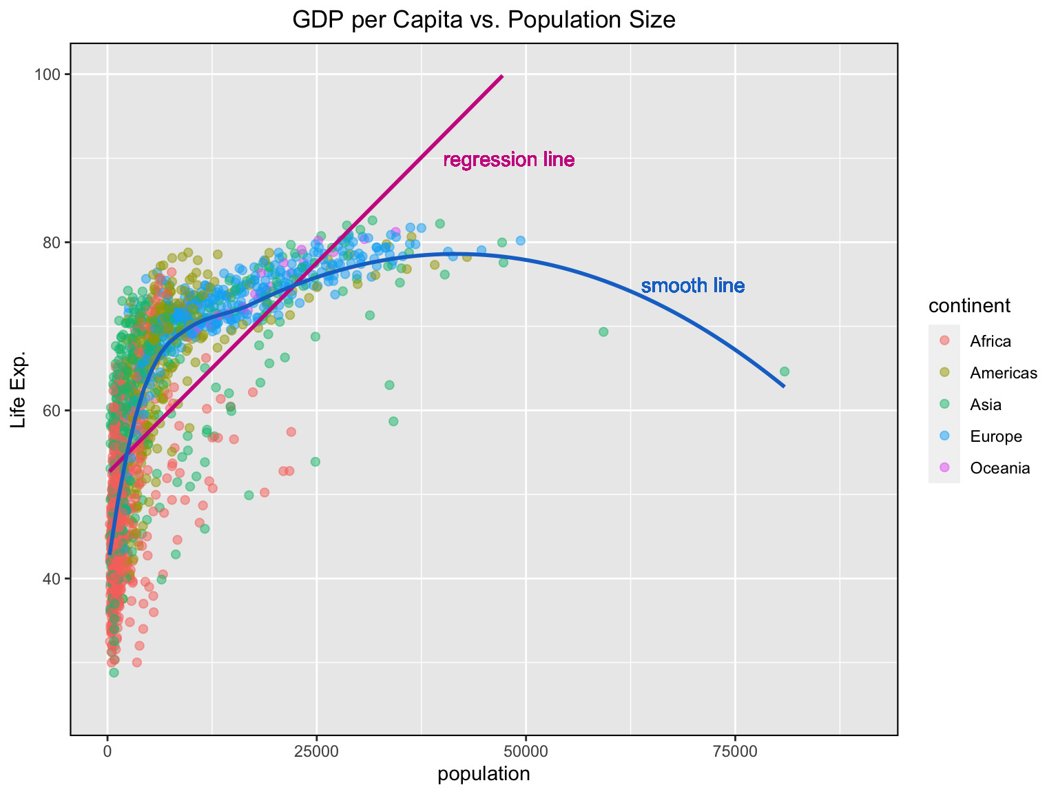
Note that the regression and smooth lines have changed their shapes 😳… all those warnings 😬 What’s going on?! 😲
When using xlim() and ylim(), the points outside the specified range are deleted and are not considered while drawing the line using geom_smooth(). This feature might come in handy when you wish to know how the line of best fit would change when some extreme values or outliers are removed.
Thankfully, there is another way to change the limits of the axis without deleting the points by simply zooming in on the region of interest. This is done using coord_cartesian(). You can try to replace xlim() and ylim() commands in the previous code chunk with the code below to see what will happen.
coord_cartesian(xlim = c(0, 90000), ylim = c(25, 100)) # zooming in specified limits of the x & y axisYou can set the breaks on the x axis and label them by using scale_x_continuous(). Similarly, can you can do it for the y axis?
Try to play with changing the colour palette. For more options check Sequential, diverging and qualitative colour scales from colorbrewer.org.
These are build-in themes which control all non-data display. You should use theme_bw() to have a white background or theme_dark() for dark grey. For more build-in themes click here.
ggplot(gapminder, aes(x = gdpPercap, y = lifeExp)) +
  geom_point(aes(col = continent), alpha = 0.5, shape = 20, size = 3) +
  geom_smooth(method = "lm", se = F, col = "maroon3") +
  geom_smooth(method = "loess", se = F, col = "dodgerblue3") +
  labs (title= "GDP per Capita vs. Population Size",
        x = "population", y = "Life Exp.") +
  theme(legend.position = "right",
        panel.border = element_rect(fill = NA,
                                    colour = "black",
                                    size = .75),
        plot.title=element_text(hjust=0.5)) +
  geom_text(x = 80000, y = 125, label = "regression line", col = "maroon3") +
  geom_text(x = 90000, y = 75, label = "smooth line", col = "dodgerblue3") +

  # change breaks and label them
  scale_x_continuous(breaks = seq(0, 120000, 20000), labels = c("0", "20K", "40K", "60K", "80K", "100K", "120K")) +

  # change color palette
  scale_colour_brewer(palette = "Set1") +

  # white background theme
  theme_bw()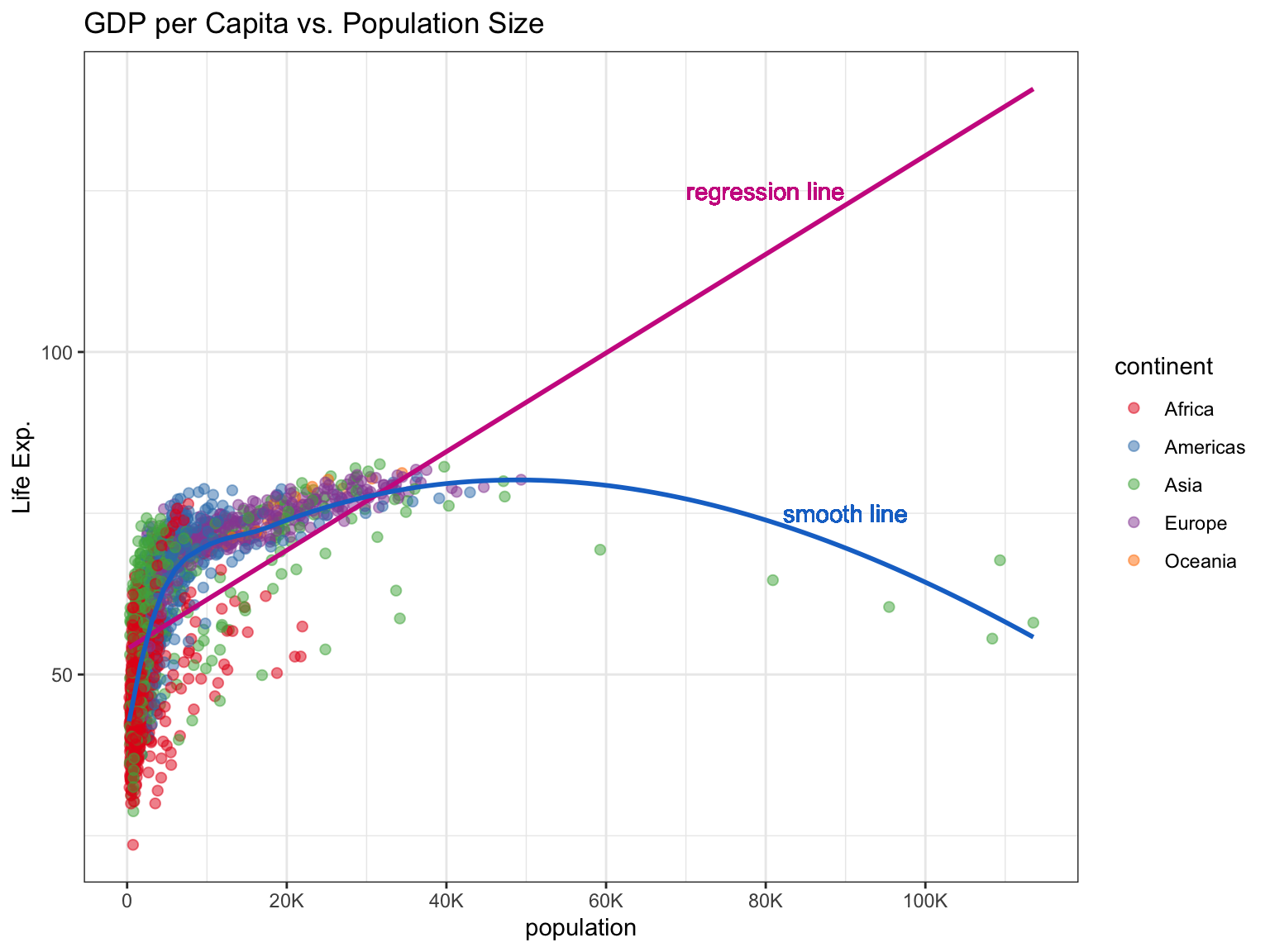
There is a ggthemes library of themes that will help you create stylish ggplot charts used by different journals like the Wall Street Journal or the Economist. See what other themes you can use by going to this website
## If you don't have ggthemes installed yet, uncomment and run the line below
#install.packages("ggthemes")
library(ggthemes)
ggplot(gapminder, aes(x = gdpPercap, y = lifeExp)) +
  geom_point(aes(col = continent), alpha = 0.5, shape = 20, size = 3) +
  geom_smooth(method = "lm", se = F, col = "darkred") +
  geom_smooth(method = "loess", se = F, col = "darkgreen") +
  labs (title= "GDP per Capita vs. Population Size",
        x = "population", y = "Life Exp.") +
  theme(legend.position = "right",
        panel.border = element_rect(fill = NA,
                                    colour = "black",
                                    size = .75),
        plot.title=element_text(hjust=0.5)) +
  geom_text(x = 80000, y = 125, label = "regression line", col = "darkred") +
  geom_text(x = 90000, y = 75, label = "smooth line", col = "darkgreen") +
  scale_x_continuous(breaks = seq(0, 120000, 20000), labels = c("0", "20K", "40K", "60K", "80K", "100K", "120K")) +

  # Wall Street Journal theme
  scale_colour_wsj() +
  theme_wsj()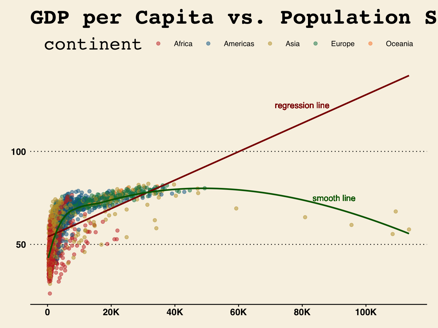
You are ready to make publication-ready visualizations in R. 😎 You can go further and explore for yourself to see if you can produce BBC style ggplot charts like those used in the BBC’s data journalism. Check out the BBC Visual and Data Journalism cookbook for R graphics.
Lay out panels in a grid
Sometimes it might be hard to read one panel plot, like the one we have just created in which it is not very easy to see the points of each continent. To make it easier to follow and to understand the information you are trying to depict, it would be more effective to present different categories of the same information in a clear set of multi-panel plots. This is easy to do by applying powerful faceting functions of the ggplot2: facet_wrap() and facet_grid().
ggplot(gapminder, aes(x = gdpPercap, y = lifeExp)) +
  geom_point(aes(col = continent), alpha = 0.5, shape = 20, size = 3) +
  geom_smooth(method = "lm", se = F, col = "darkred") +
  geom_smooth(method = "loess", se = F, col = "black") +
  labs (title= "GDP per Capita vs. Population Size",
        x = "population", y = "Life Exp.") +
  theme(legend.position = "right",
        panel.border = element_rect(fill = NA,
                                    colour = "black",
                                    size = .75),
        plot.title=element_text(hjust=0.5)) +
  scale_x_continuous(breaks = seq(0, 120000, 20000), labels = c("0", "20K", "40K", "60K", "80K", "100K", "120K")) +
  scale_colour_wsj() +
  theme_wsj() +

  # forms a matrix of scatterplots for each continent
  facet_grid(rows = vars(continent))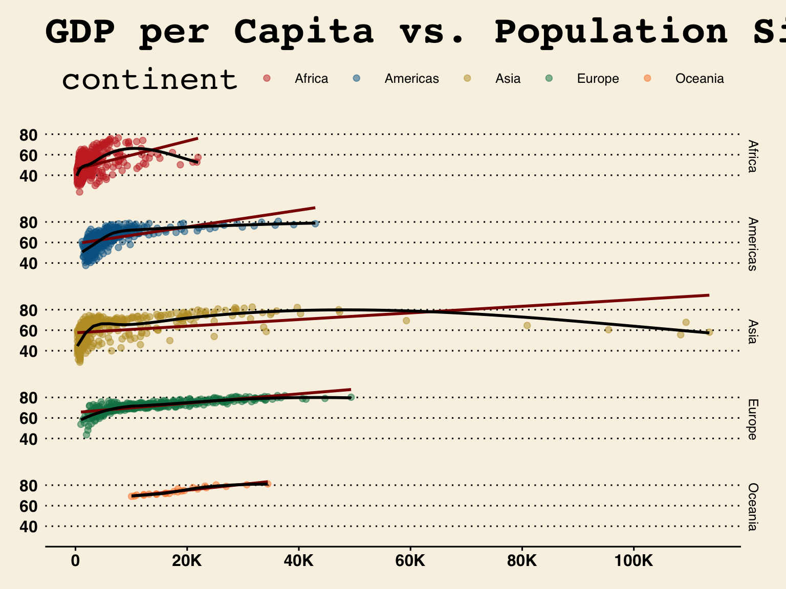
The main difference between facet_wrap() and facet_grid() is that the former can string together ggplots in different facets using a single variable, while the latter can do it for more than one.
Try to explore the two functions for yourself and see where it will take you.
💪 There is a challenge:
dplyr’sgroup_by()function enables you to group your data. It allows you to create a separate df that splits the original df by a variableboxplot()function produces boxplot(s) of the given (grouped) values
Knowing about the group_by() and the boxplot() functions and using gapminder data, can you compute the median life expectancy for the year 2007 by continent and visualise your result?
😃🙌 Solution: code
Let us look at the median life expectancy for each continent
gapminder %>%
    group_by(continent) %>%
    summarise(lifeExp = median(lifeExp))
## `summarise()` ungrouping output (override with `.groups` argument)## # A tibble: 5 x 2
## continent lifeExp
## <fct> <dbl>
## 1 Africa 47.8
## 2 Americas 67.0
## 3 Asia 61.8
## 4 Europe 72.2
## 5 Oceania 73.7😃🙌 Solution: graph
# visualise the information
library("ggplot2")
ggplot(gapminder, aes(x = continent, y = lifeExp)) +
  geom_boxplot(outlier.colour = "hotpink") +
  geom_jitter(position = position_jitter(width = 0.1, height = 0), alpha = .2) +
  labs (title= "Life Exp. vs. Continent",
        x = "Continent", y = "Life Exp.") +
  theme(legend.position = "none",
        panel.border = element_rect(fill = NA,
                                    colour = "black",
                                    size = .75),
        plot.title=element_text(hjust=0.5))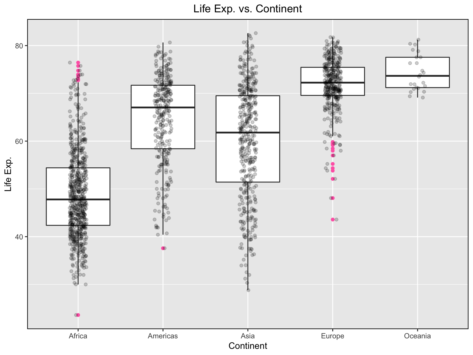
Case study: NO2 2017 😁
Let’s try to combine everything we have learnt so far and practise using 2017-NO2.csv data.
library(tidyr)
library(forcats)
no2 <- read.csv("http://data.sepa.gov.rs/dataset/ca463c44-fbfa-4de9-9a75-790995bf2830/resource/74516688-5fb5-47b2-becc-6b6e31a24d80/download/2017-no2.csv",
                stringsAsFactors = FALSE,
                fileEncoding = "latin1")
new_no2 <- no2 %>%
  gather("place", "no2", -Datum, factor_key = TRUE) %>% # stack all columns apart from `Datum`
  mutate(place = fct_recode(place,
                            "NS_Spens" = "Novi.Sad.SPENS.NO2",
                            "BG_Most" = "Beograd.Mostar.NO2",
                            "BG_Vracar" = "Beograd.Vraèar.NO2",
                            "BG_ZelenoBrdo" = "Beograd.Zeleno.brdo.NO2",
                            "KG" = "Kragujevac..NO2",
                            "NI" = "Ni..IZJZ.Ni...NO2",
                            "UZ" = "U.ice..NO2"))
glimpse(new_no2)
## Rows: 2,555
## Columns: 3
## $ Datum <chr> "01.01.2017", "02.01.2017", "03.01.2017", "04.01.2017", "05.01.…
## $ place <fct> NS_Spens, NS_Spens, NS_Spens, NS_Spens, NS_Spens, NS_Spens, NS_…
## $ no2 <dbl> 22.89, 32.94, 14.86, 22.73, 20.89, 10.47, 9.58, 15.99, 14.46, 9…new_no2 %>%
group_by(place) %>%
filter(!is.na(no2)) %>%
summarise(mean_no2 = mean(no2)) %>% # !is.na(): is not NA; omits the missing values
ggplot(aes(x = place, y = mean_no2, fill = place)) + # fill: colours each bar differently
geom_bar(stat = "identity") +
xlab("Place") +
scale_fill_brewer(palette = "Dark2") + # colour scheme "Dark2"
theme(legend.position="bottom",
axis.text.x = element_blank(),
axis.ticks.x = element_blank()) # ## `summarise()` ungrouping output (override with `.groups` argument)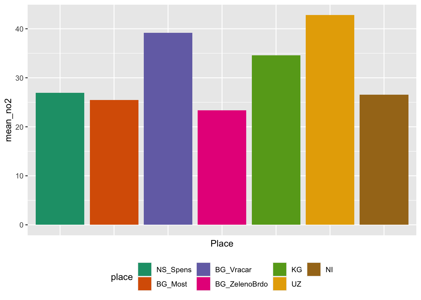
YOUR TURN 👇
Practise by doing the following set of exercises:
Choose a data set from https://data.gov.uk that is interesting to you. Import the dataset into R and examine what kinds of variables there are. What plots would you recommend using to help people get to know the dataset?
Go back to NO2 2017 case study:
What are the questions you can ask based on the available information within the dataset?
What plots would you recommend using to help to answer those questions?
Create appropriate visualisations for i) & ii)
Useful links:
tidyverse, visualization, and manipulation basics
Introduction to R graphics with ggplot2
An example from the Financial Times
BBC Visual and Data Journalism cookbook for R graphics
© 2020 Tatjana Kecojevic